Chart Component
CraftMyPDF is a powerful PDF and image generation API that offers a seamless experience through its user-friendly drag and drop template editor. With CraftMyPDF, users can effortlessly create visually stunning documents and graphics without the need for complex coding or design skills.
One of the standout features of CraftMyPDF is its chart component, which supports a wide range of chart types. Users can easily incorporate dynamic charts into their PDFs and images, enhancing the visual representation of data and insights.
The supported chart types include
- Line charts
- Area charts
- Bar charts
- Pie charts
- Donut charts
- ApexCharts
CraftMyPDF leverages the powerful ApexCharts library, ensuring high-quality and flexible chart rendering. Whether you need to create professional reports, visually appealing infographics, or data-driven presentations, CraftMyPDF empowers you to effortlessly generate stunning PDFs and images, complete with captivating charts, all within a user-friendly and intuitive interface.
To create a Chart component, simply drag it and drop it to the desired location where you want it to appear.
The mostly used properties in the chart components are:
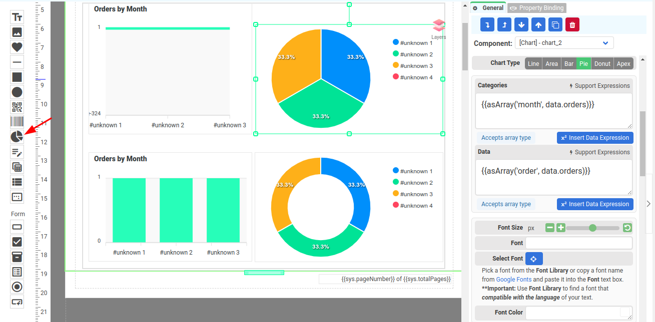
- Categories - The x values on a chart(Line/Area/Bar) or labels on slices(Pie chart/Donut)
- Data - The data points
Extracting data from JSON as a one-dimensional array
The properties Categories and Data only support one-dimensional arrays. In order to extract data from your JSON, you need to use the expression function asArray.
The following is a JSON data with order information in the orders array
{
    "orders": [
        {
            "month": "Jan",
            "order": 100
        },
        {
            "month": "Feb",
            "order": 200
        },
        {
            "month": "Mar",
            "order": 300
        }
    ]
}
The following example demonstrates how to extract the order from an orders array using the "asArray" expression.
{{asArray('order', data.orders)}}The extracted orders in one-dimensional array
[100,200,300]The following is an expression to extract all the values from the field month as one dimensional array
{{asArray('month', data.orders)}}The extracted months
["Jan", "Feb", "Mar"]Using ApexCharts
One standout feature of CraftMyPDF is its chart component, which seamlessly integrates with ApexCharts.
While CraftMyPDF offers a selection of standard charts, it also allows users to create custom charts using the powerful capabilities of ApexCharts. This flexibility empowers users to visualize data in unique and personalized ways, enhancing the impact of their generated PDFs and images. With CraftMyPDF and ApexCharts, the possibilities for stunning visual representations are endless.
To use ApexCharts, simply select Apex for the Chart Type
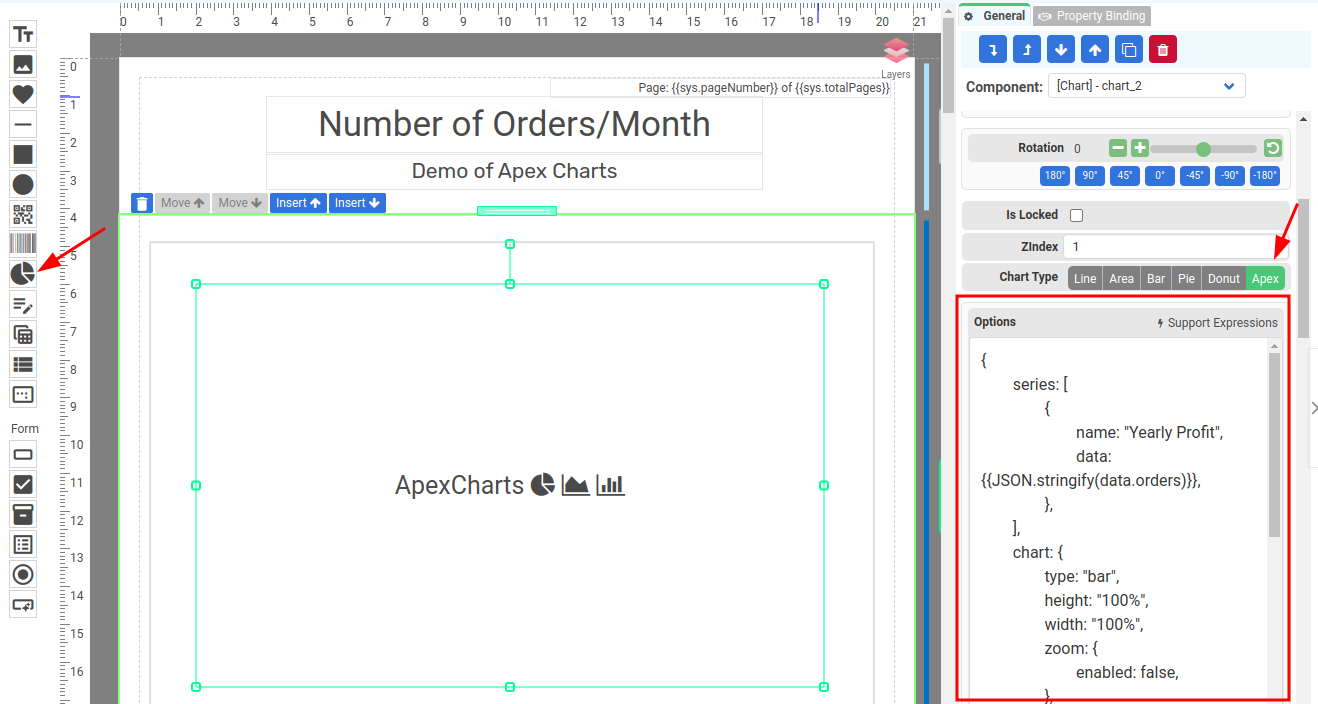
The property Options is the ApexCharts options, which can be found on ApexCharts Official docs
Example
To illustrate how to use ApexCharts options, the following is an example of changing the color of the bars if the value is less than 150 using ApexCharts.
The following is the sample data in the Data tab
{
    "orders": [
        {
            "x": "Jan",
            "y": 100
        },
        {
            "x": "Feb",
            "y": 200
        },
        {
            "x": "Mar",
            "y": 300
        }
    ]
}
The following is the ApexCharts Options
{
	series: [
		{
			name: "Yearly Profit",
			data: {{JSON.stringify(data.orders)}},
		},
	],
	chart: {
		type: "bar",
		height: "100%",
		width: "100%",
		zoom: {
			enabled: false,
		},
		animations: { enabled: false },
		toolbar: { show: false },
	},
	plotOptions: {
		bar: {
			horizontal: false
		},
	},
	colors: [
		function ({ value, seriesIndex, w }) {
			if (value < 150) {
				return "#FF0000";
			} else {
				return "#02DFDE";
			}
		},
	],
};
Let's go through the options and understand what each of them does:
- series: It represents an array of series objects that contain the data to be plotted on the chart. In this case, there is only one series object defined with the name "Yearly Profit" and its data is obtained from data.orders using JSON.stringify().
- chart: It defines the configuration options related to the chart itself. Here are the properties used:
- type: Specifies the type of chart to be rendered. In this case, it is set to "bar" to create a bar chart.
- height: Sets the height of the chart. It is set to "100%" which means the chart will occupy the full height of its container.
- width: Sets the width of the chart. It is set to "100%" to occupy the full width of its container.
- zoom: Allows zooming and panning interactions with the chart. It is set to enabled: false to disable these interactions.
- animations: Controls the animations of the chart. Here, it is set to enabled: false to disable animations.
- toolbar: Displays or hides the chart's toolbar. In this case, it is set to show: false to hide the toolbar.
- plotOptions: It contains options that are specific to each series type. Here, under the bar property, the horizontal option is set to false, indicating that the bars should be vertical (the default behavior).
- colors: It allows you to customize the colors of the chart elements based on certain conditions. It is defined as an array of functions that determine the color for each data point. In this case, if the value of a data point is less than 150, it will be assigned the color #FF0000 (red), otherwise it will be assigned the color #02DFDE (a shade of cyan).
These options provide the necessary configurations to create a bar chart using ApexCharts, with specific settings for the series, chart, plot options, and colors.
Please note that the animation and toolbar are both turned off.