Label and Image
Label Component
The label component is an incredibly versatile tool that serves various purposes within PDF templates. It provides a powerful means to showcase labels, descriptions, summaries, and other text-based information. By incorporating label components with expression fields, you can generate dynamic PDF documents with ease.
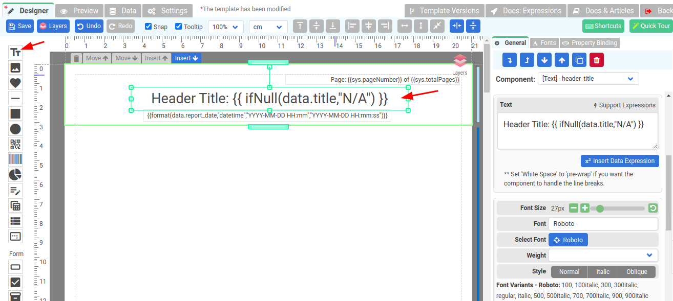
To create a Label component, drag a Text component and drop it where you want it to appear.

Properties of Label component
- Text: The text to be display and it supports expressions.
- Font size: The size of the font of the Label element.
- Background: Background color of the Label element.
- Font: Font family the Label element, use “Select Font” to select a font.
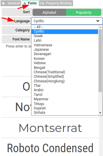
- Select Font: Click on the Blue button to choose a font from our font library. We support different languages, remember to select a font that is compatible with the language of your text, or else your generated PDFs will display with square boxes.
- Align: the horizontal alignment of the text inside the Label element. Supported alignments: left, right, center, and justified.
- Weight: The weight (or boldness) of the font. The weights available depend on the Font that is currently set.
Supported languages
We provide support for a wide range of languages. To ensure that your generated PDFs are displayed correctly, it is important to select the right font that supports your text language.
When you click on the Select Font option in the property panel or Fonts tab, you will be able to choose a font from our extensive Font library that is specifically designed to be compatible with the language of your text. This step is crucial because if you overlook it, your PDFs may appear with unsightly square boxes or random characters instead of the intended characters.

Image Component
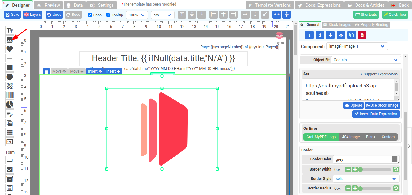
The Image component serves the purpose of displaying images within the PDF template. To add an Image component, simply locate it in the toolpanel and drag-and-drop it to the desired position within the template.
Once added, you can customize the Image component to suit your needs. This includes configuring the image source**(Src)**, specifying the image file or URL that should be displayed. To set the image source, you have the option to either upload an image file from your local system or provide a direct URL to an image hosted online. In addition, the Src property supports Expressions for dynamic image.

Properties of Image component
- Object Fit: This property determines how the image should be resized to fit its container.
- Contain: The image is scaled to maintain its aspect ratio while fitting within the Image component.
- Cover: The image is sized to maintain its aspect ratio while filling the entire element of the Image component.
- Fill: The image is sized to fill the Image component.
- Scale-down: The image is sized as if none or contain were specified, whichever would result in a smaller concrete object size.
- Src: This property contains the path to the image you want to embed. It can be used along with expressions to create a dynamic image.