Line, Rectangle and Circle
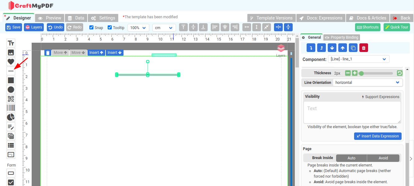
Line Component
The line component is used to draw vertical or horizontal lines. To create a horizontal line, drag the component and drop it where you want it to appear. To make a vertical line, select "vertical" for the Line Orientation. You can also change the Thickness or Color of the Line component.
Tips: When constructing a table with lines and the section is designed to dynamically expand, consider using percentage for the height and width. For example "100% height" for vertical lines or "100% width" for horizontal lines. By doing so, you ensure that the lines adapt and grow proportionally as the section expands.
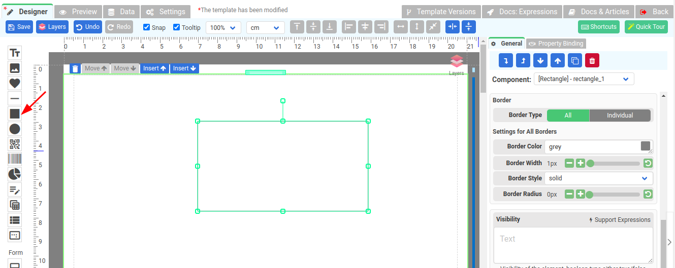
Rectangle Component
The Rectangle component provides you with the ability to draw rectangular shapes with various customization options. With this component, you can not only create simple rectangles but also add rounded corners. This feature allows you to give your rectangles a softer and more polished appearance.
Additionally, the Rectangle component offers the flexibility to select both a fill color and a border color for your shape. This means that you can choose the desired color to fill the interior of the rectangle, giving it a solid or gradient appearance. Furthermore, you can specify a border color to outline the edges of the rectangle, allowing for clear visual separation from the surrounding elements.
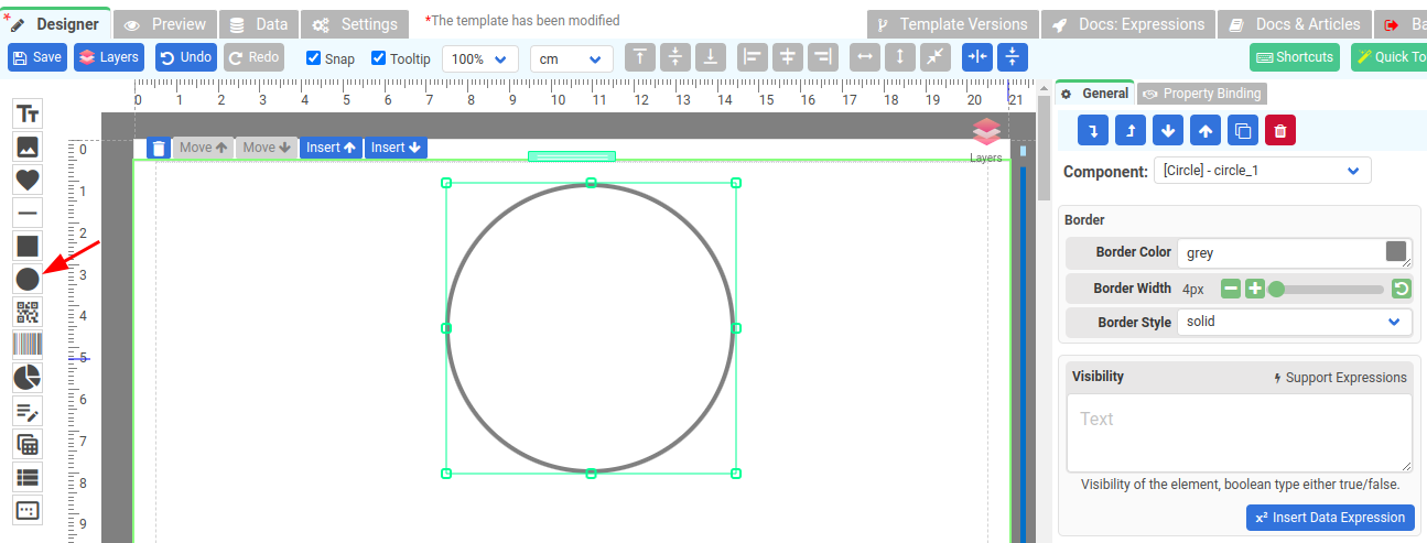
Circle Component
The Circle component allows users to add circular shapes to their reports, enhancing the visual appeal and providing a clear representation of data or design elements.
With the Circle component, users can customize various aspects of the circular shape, including its size, position, color, and border properties. This allows for flexible and creative designs that can be tailored to meet specific reporting requirements.