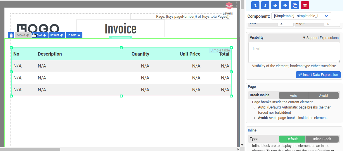
Simple table Component
The Simple Table component is specifically designed to present an array of data in tabular format. It offers a hassle-free way for displaying repeating rows of information without the need to use a data-bound Normal Section.
The following are the steps to use the Simple Table component:
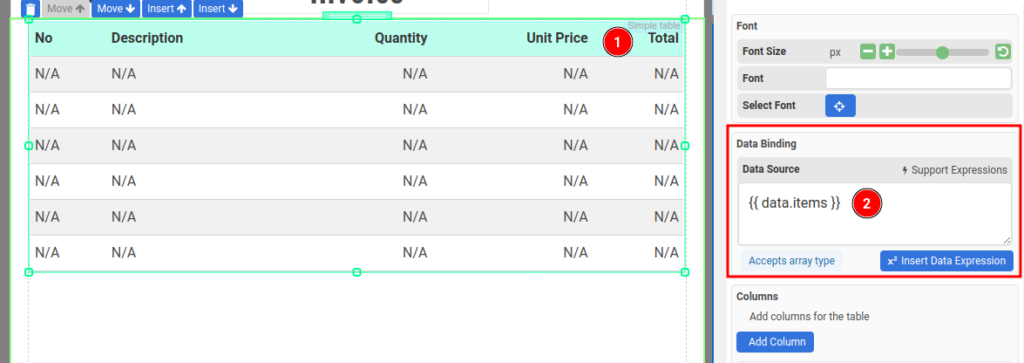
Step 1: Data Binding
Configure Data Binding to bind the Simple Table to an array
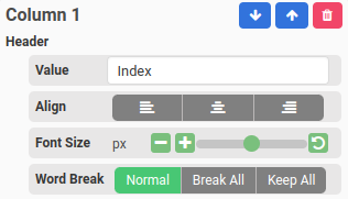
Step 2: Adding columns
Then, add new columns to the Simple Table component. Click the button Add Columns in the Columns section in the property panel.
A column consists of 3 elements:
- Column Header
- Column Content/Cell
- Column Footer
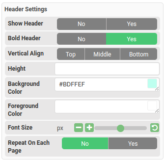
i. Column Header
The header of the column, it’s turned on by default. The following is where you configure the header
To change the background color, height, and font size of the header, you can update the Header Settings in the property panel.
ii. Column Content or Cell
The content of the repeating rows.
The cell value can be either an (a) Expression of a (b) JSON field
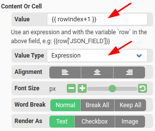
(a) Expression Value Type
Expression value type is used for data that requires formatting or calculation. To use an expression in the cells:
- Set the Value type to Expression and enter an expression in the Value field.
- To access the items, use the variable row. For example, if the Data Source is set to {{data.items}} and there is a field named description in the items array, you can enter an expression like {{row["description"]}} in the Value field.
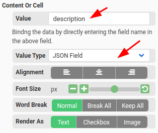
(b) JSON Field Value Type
The JSON field value type is used for simple data. To use the JSON field value type, follow these steps:
- Set the Value type to JSON Field.
- Enter the desired JSON field in the Value field. For example, if the Data Source is set to {{data.items}} and the items array contains a field named description, you can enter description in the Value field.
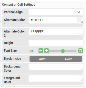
You may also change the Content or Cell settings, such as alternate colors, font size, etc., in the property panel.
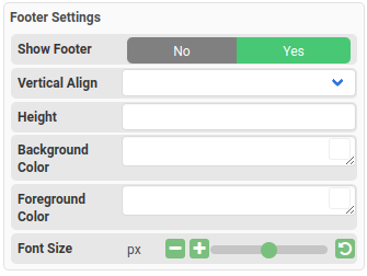
iii. Column Footer
The footer of the column. It’s disabled by default and it’s similar to Header.
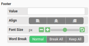
To change the background color, height, and font size of the header, you can update the Footer Settings in the property panel.
Simple Table which spans across multiple pages
If a simple table spans across multiple pages, please set the Layout Mode to Vertical flow for the parent section.